HALLIE ROSE DESIGN
Brand Identity
— BRAND IDENTITY — COLOR DIRECTION — TYPOGRAPHY — PRINT COLLATERAL — WEBSITE DESIGN—
Hallie Rose Design creates interiors that balance timeless references with something unexpected. Spaces that feel collected, personal, and rich in character. The brand needed an identity with that same sensibility: grounded, warm, and quietly assured.
We developed a visual identity rooted in structure and restraint, pairing refined typography with a palette of claret, stone, tobacco, and ink. Each element was designed to extend naturally across print and digital, creating a cohesive foundation for the studio’s evolving body of work.
An identity that doesn’t announce itself. It simply belongs.
EXPLORATION
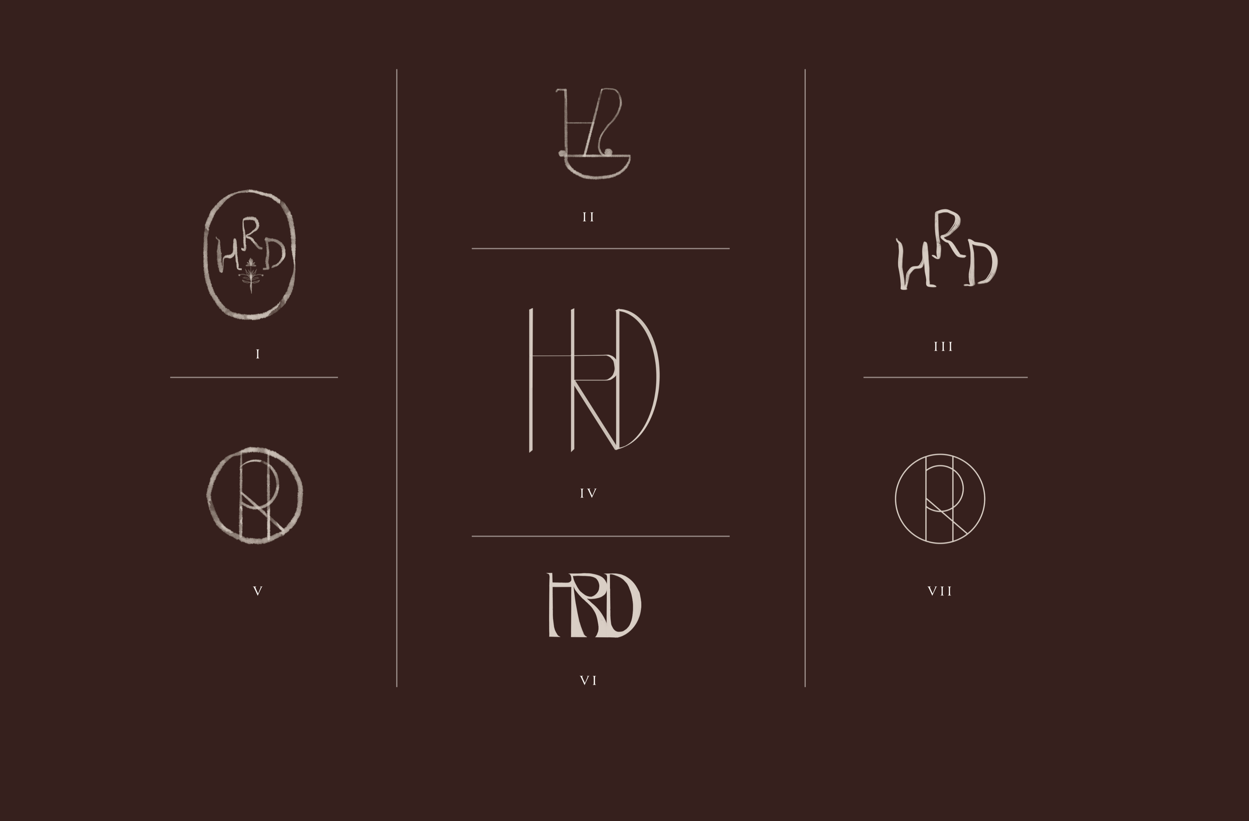
Exploring proportion, structure, and the relationship between the three letterforms.
PALETTE
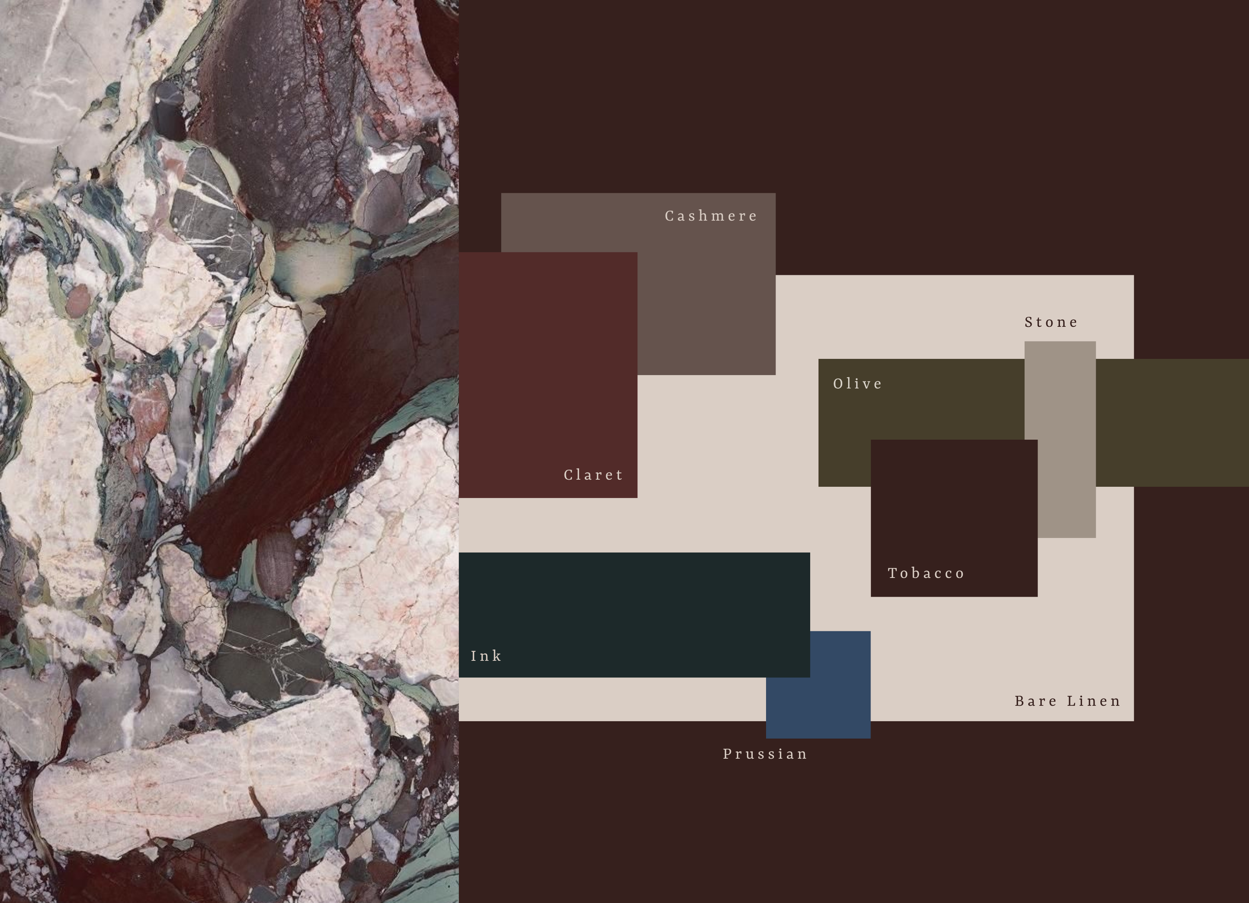
Drawn from the materials and tones found throughout Hallie’s interiors, the palette brings together warm neutrals, grounded shades, and rich hues creating a color system that feels timeless, and distinctly her own.
IN PRINT
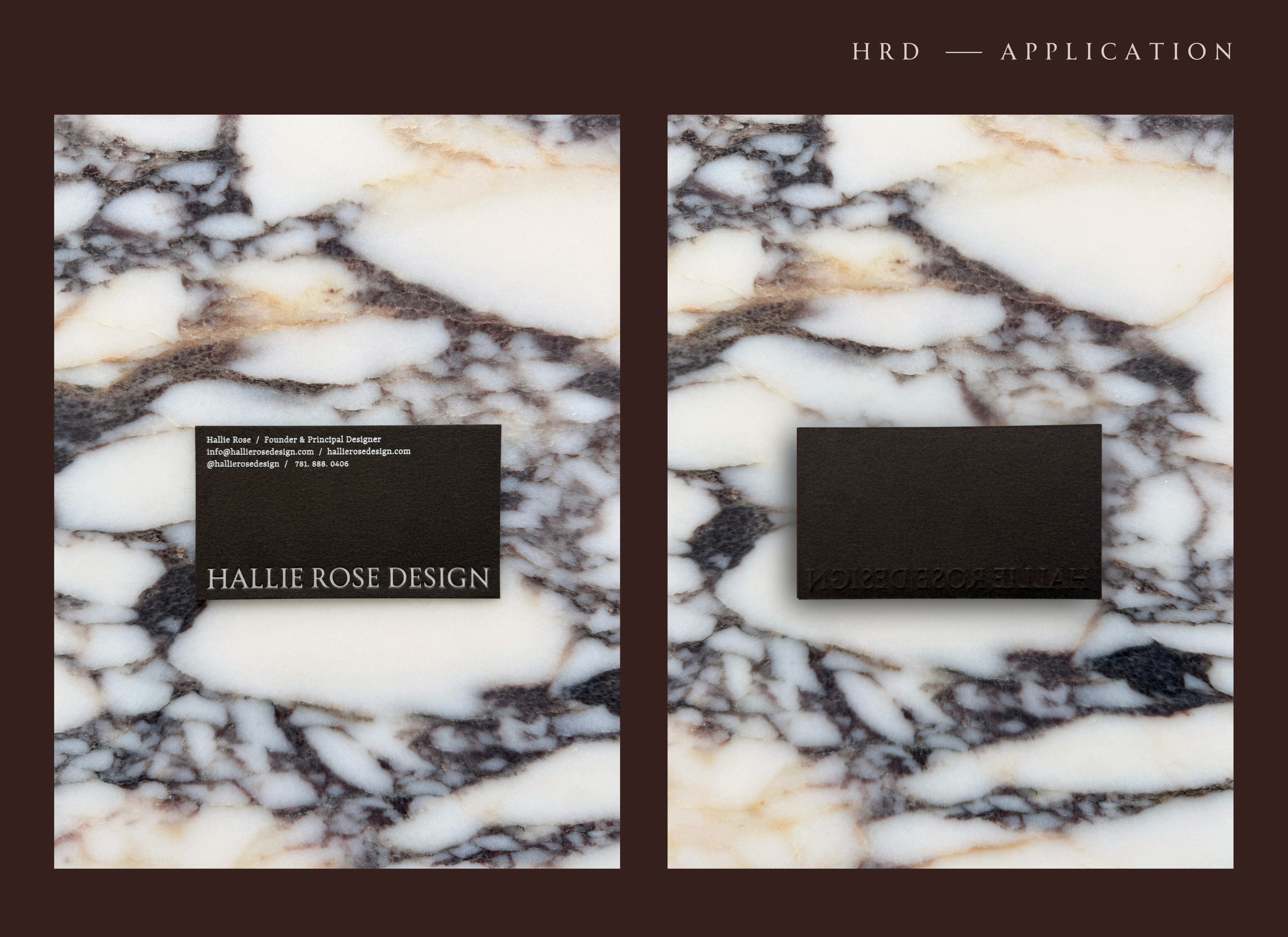
The business card translates the identity into something tactile. Serif typography, rich tobacco textured stock, and subtle embossed details create an object that feels quiet but substantial. Considered from every angle.
DIGITAL EXPERIENCE
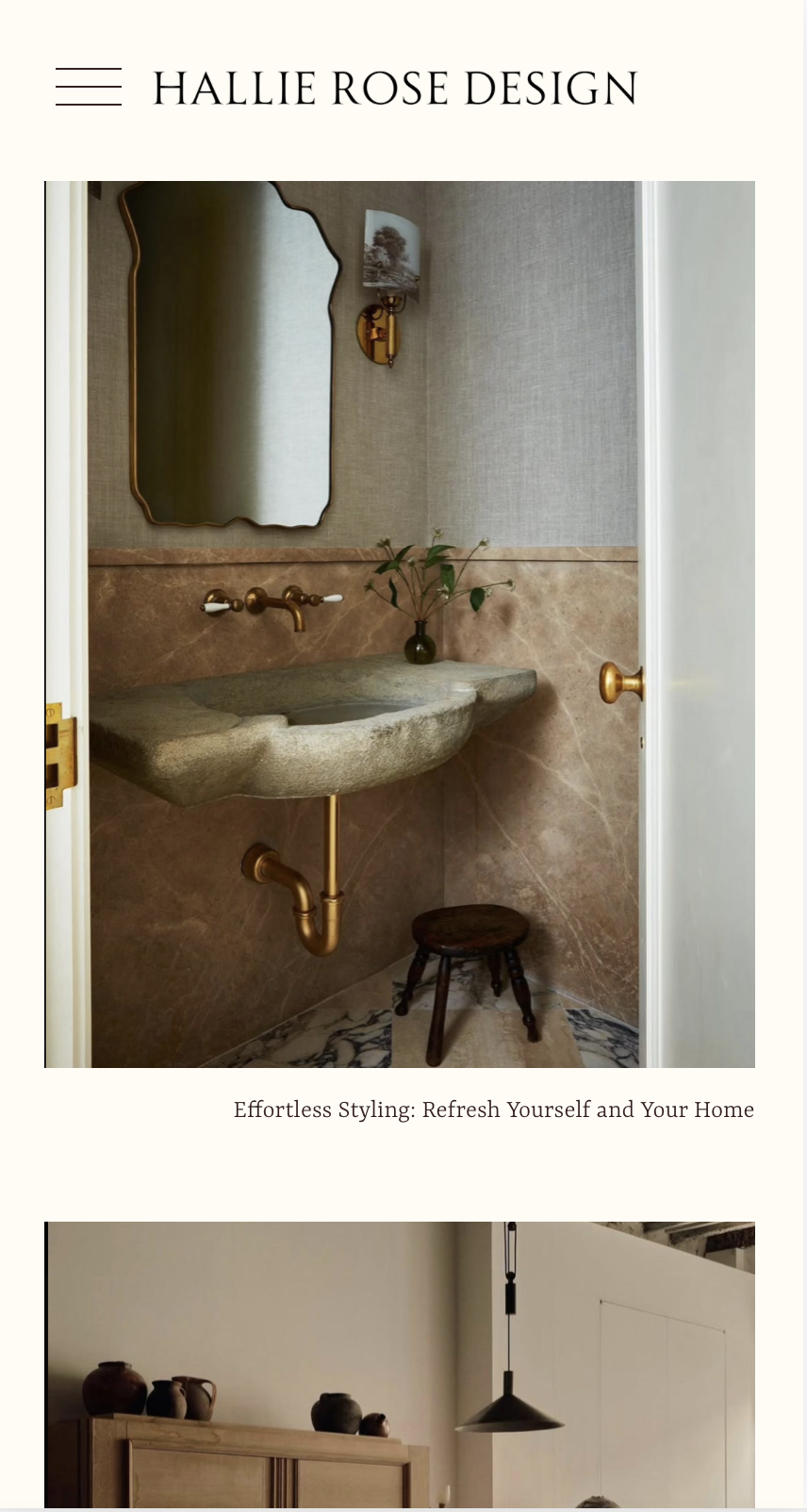
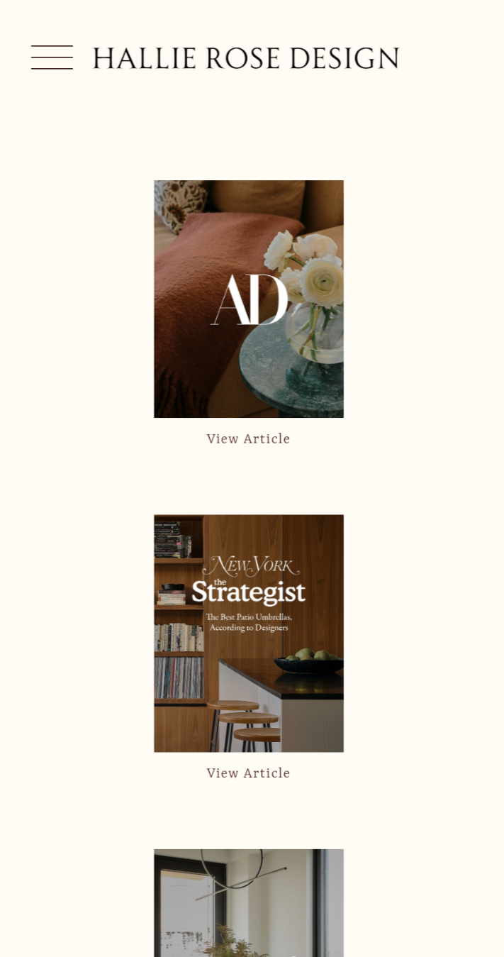
The identity extends into an editorial website designed to let Hallie’s interiors lead. Generous space, considered typography, and intuitive navigation create a quiet framework for her projects, press, and point of view—carrying the warmth and restraint of the brand through every screen.