KEY
Brand Identity
— BRAND STRATEGY — BRAND IDENTITY — CREATIVE DIRECTION — PACKAGING —
KEY is a ready-to-wear collection built around the idea of the key piece. The one that unlocks a wardrobe. Confident, versatile, and always with a sense of play, the brand needed an identity that felt equally distinctive. Forward without feeling precious.
We shaped the brand concept around a language of access, arrival, and being in the know. That verbal world carries through the packaging and collateral, giving each piece its own personality while remaining unmistakably KEY.
The visual identity centers on a custom typographic mark and signature key emblem, paired with a palette of oxblood, cream, pale blue, and tomato red. Designed to move naturally across hangtags, woven labels, packaging, print, and apparel, the system brings the collection into one cohesive and collectible world.
You’re early. You’re in.
EXPLORATION
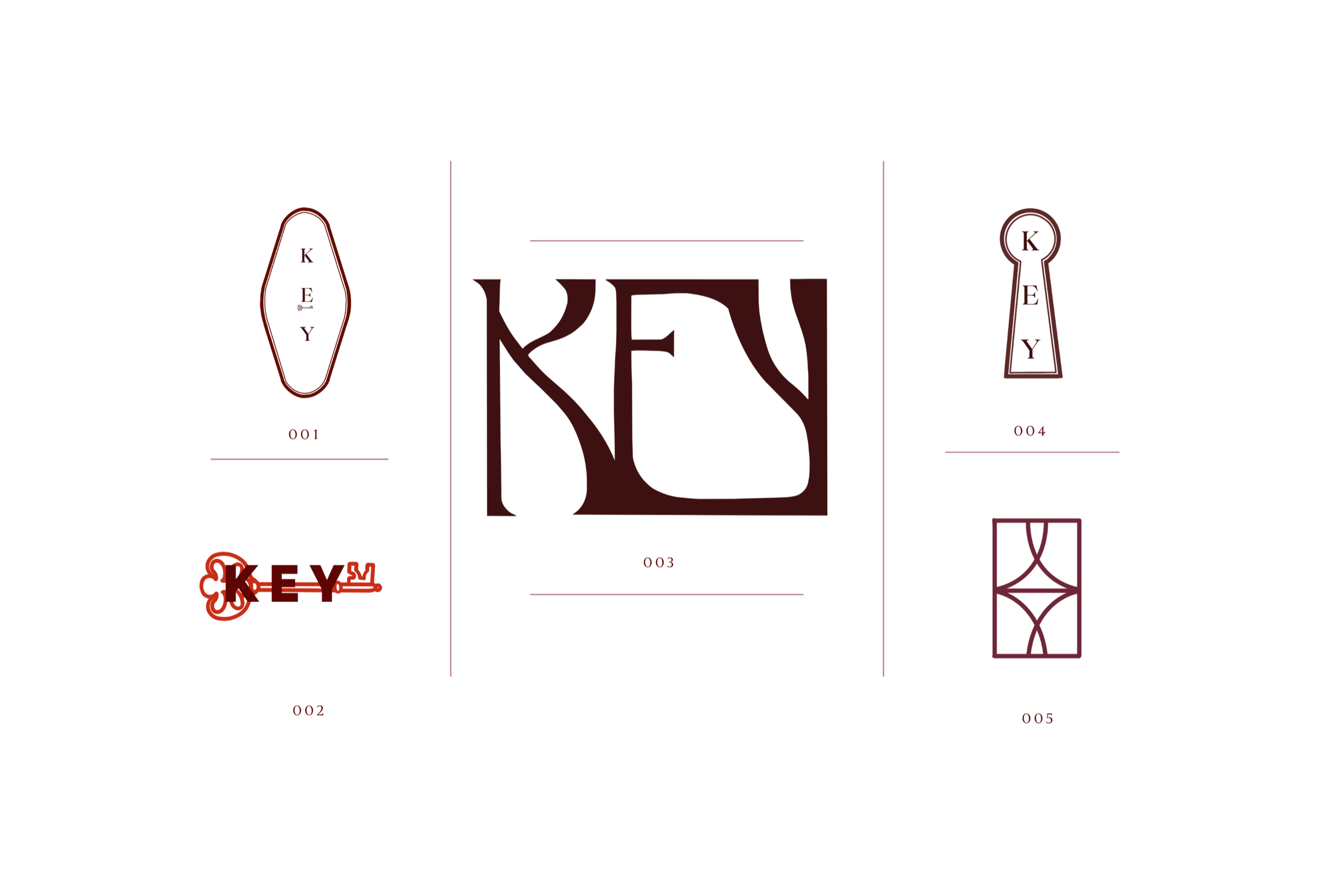
The mark exploration moved between literal references and more abstract expressions of access. From key tags and keyholes to custom typographic forms. Inspired by the interlocking geometry of an antique puzzle lock, the selected monogram weaves the letters of KEY into a single sculptural emblem. Designed to reward a second look and move effortlessly across packaging, print, and apparel.

PALETTE
Grounded in oxblood and cream, the palette is lifted by pale blue and interrupted with tomato red. Dusty rose, olive, and pistachio bring softness and depth creating a color system that feels unexpected, expressive, and distinctly KEY.
IN PRINT
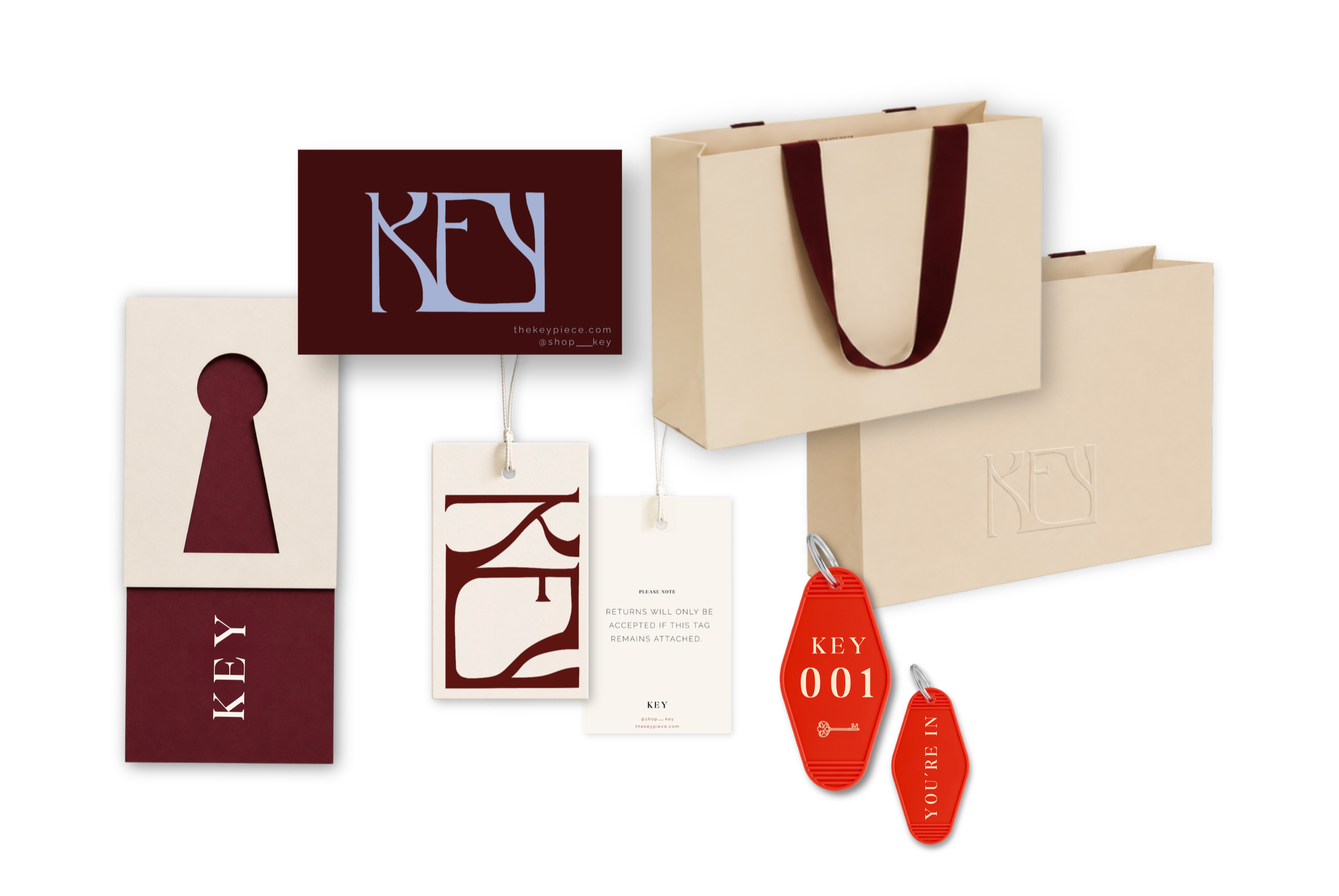
The packaging was designed to feel like an invitation into the world of KEY. Across shopping bags, garment tags, and printed collateral, oversized marks, tactile finishes, and playful language transform functional pieces into objects worth holding onto. Each one reinforcing the feeling that you’re in.